Greetings from InfraVis Director Monica Billger and the Management Team
|
Spring is in the air, and InfraVis is approaching the end of this reporting period. It’s refreshing to take a moment to reflect on the past year and bring everything into balance. 2025 turned out to be a highly productive year, during which we contributed visualizations to over 100 research projects. Our teams are fully engaged with ongoing support projects, and we are excited to see the new initiatives taking shape following the 2025 autumn call. We look forward to a productive spring filled with meaningful collaborations and inspiring work together with our colleagues across the country.
Monica Billger
| | | | Express your interest to use InfraVis in your next application to the Swedish Research Council (VR). It is easy!
Are you planning to apply for funding for a research project? Remember that you can indicate your interest in InfraVis directly in your Swedish Research Council (VR) application by selecting us from the dropdown list of national infrastructures.
If you wish, you are also welcome to contact us directly for support during the proposal phase. We are happy to help develop or describe the visualization aspects of your project and provide input on the expected scope of work.
We look forward to helping you strengthen your research with expert‑driven visualization. | | | | |
InfraVis Support Projects
InfraVis received a broad range of applications in the 2025 call, and most projects are now starting up.
However, the annual call is not the only way to collaborate with us. For projects expected to require fewer than 80 hours of support, no formal application is needed. Simply reach out, and together we will explore how we can assist you. | | | | |
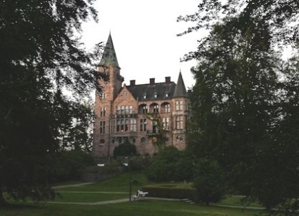
Upcoming InfraVis Days in Växjö
InfraVis Days is the biannual internal conference where the whole consortium meets to exchange knowledge, share experiences, and engage with the hosting node. This spring, Linnaeus University will welcome us. We are looking forward to castles and lakeside walks complementing workshops, demonstrations, and discussions.
| | | |
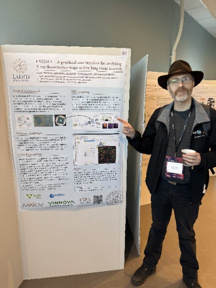
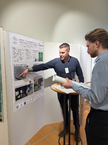
InfraVis at the 37th MAX IV User Meeting
InfraVis participated in the 37th MAX IV User Meeting in Lund, presenting two posters from the Lund University node. The meeting highlighted major anniversaries for MAX IV and focused on the upcoming MAX4U upgrade.
For InfraVis, the event provided valuable contact with user communities and insight into emerging visualization needs, strengthening collaborations as MAX IV enters its next phase. | | | |
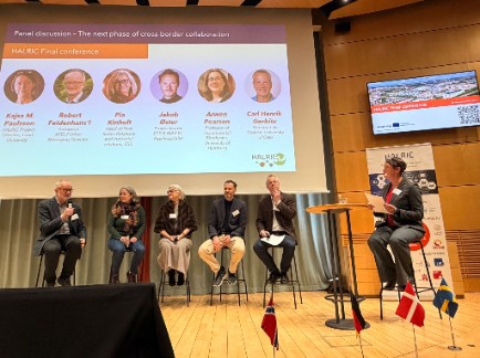
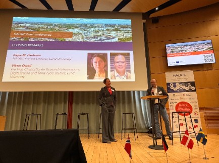
InfraVis at HALRIC Final Conference
Cross-border collaboration in data analysis and visualization is key to maximising the value of research infrastructures.
At the final HALRIC conference, Anders Bjorholm Dahl (DTU/QIM) and Emanuel Larsson (CIPA/InfraVis, LU) showed how coordinated expertise across borders leads to stronger research outcomes. Over three years, HALRIC has supported more than 80 pilot projects involving major facilities such as MAX IV, ESS, DESY and European XFEL, as well as other types of infrastructures across the HALRIC partner consortium. Many relied on QIM and CIPA/InfraVis for advanced data analysis and visualization, demonstrating how integrated support increases scientific impact and the return on national infrastructure investments.
A central message from the conference was that data management is both a bottleneck and an opportunity. Participants emphasised the need for interoperable, long-term support structures as research data continues to grow in scale and complexity. As Vice Director of InfraVis and Director of HALRIC, Kajsa Paulsson emphasised that data management has been identified within HALRIC as a key strategic development area. These discussions resonate closely with the analysis by Vetenskapsrådet, “Bottlenecks limiting the benefits of large-scale research infrastructures”, which highlights the importance of improved coordination and long-term support structures around data.
Ongoing international cooperation is essential to make the most of our shared infrastructure investments.
| | | |
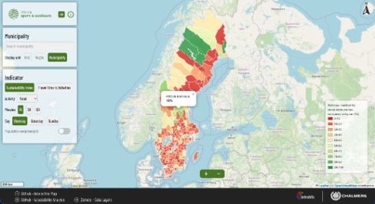
Sport and Outdoors Sustainable Accessibility Map
InfraVis Application Experts Kristin Åkerlund and Tristan Bridge (University of Gothenburg) contributed to the Sport and Outdoors Sustainable Accessibility Map: a tool that visualizes the accessibility of sports and outdoor activities across Sweden.
This interactive map presents data at both municipal and national levels, assisting planners, policymakers, and the public in understanding and improving access to recreation. It demonstrates how visualization can clarify complex societal questions and support decision‑making.
Read more about the project here. | | | |
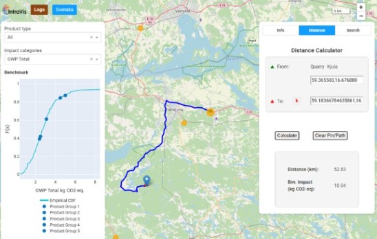
GIS Benchmark Tool for Environmental Impact of Quarries and the Mining Industry
Liang Zhou and Emin Zerman at Mid-Sweden University collaborated with InfraVis users from Chalmers University of Technology to create QuarryGIS - an interactive environmental visualization and benchmarking tool built to make quarry and construction sector impacts tangible for producers, clients, and planners. The web app combines environmental lifecycle-assessment data with geospatial context. Users can filter quarries by product type, explore benchmarks per impact category, and view sites on a live map.
With configurable settings, localisation support, and packaged deployment, the tool turns complex environmental data into actionable insights.
Read more about the project here.
| | | |
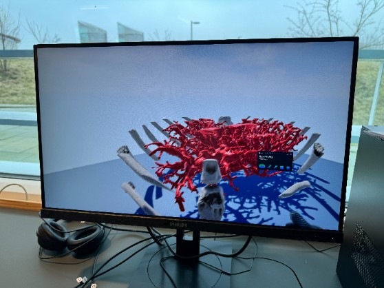
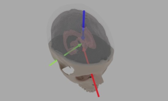
3D Modelling for Simulated Ventricular Surgery
InfraVis supported the development of improved training materials for a delicate brain‑surgery procedure involving catheter insertion into the ventricles.
Together with user Alessandro Iop, InfraVis Application Expert Ingemar Markström redesigned key 3D‑printed components, built stable scaffolds for the Jell‑O‑based artificial brain, developed motion‑capture attachments, and created a replaceable membrane that realistically replicates ventricular puncture. The result is a more accurate, repeatable, and realistic training environment. | | | |
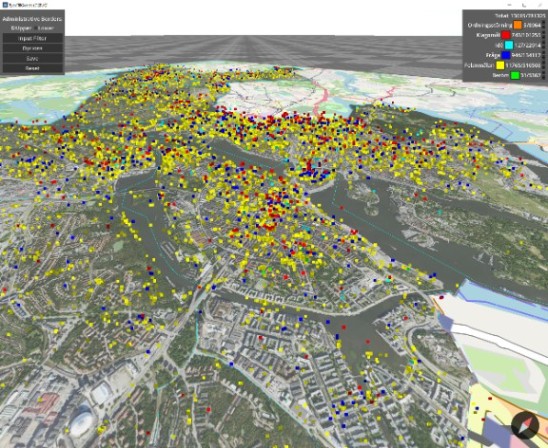
Interactive Visualization of Crowd- Sourced Urban Data from Tyck Till
Stockholm’s Tyck Till web application has generated roughly 800,000 georeferenced user reports. InfraVis transformed this rich dataset into an interactive visualization tool.
After enriching the data with district information, the team built a standalone map application in the Godot engine, enabling smooth navigation, category exploration, filtering by time and district, and contextual overlays.
InfraVis experts Filip Berendt and Julius Häger, from the KTH node, led this work. | | | | Getting to Know the InfraVis Nodes
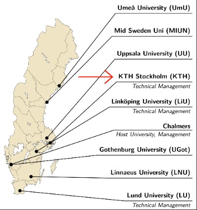
| Photo by Pernilla Josefsson | | InfraVis consists of eight nodes, based at nine universities, from Umeå in the north to Lund in the south.
| Spotlight on the KTH NodeKTH Royal Institute of Technology The InfraVis node at KTH consists of a small team with a wide range of visualization skills, including high‑performance rendering, GPU programming, XR/VR interaction design, GIS, D3, and Inviwo. As node coordinator Björn Thuresson puts it: “We can do anything!” - or at least, quite a lot.
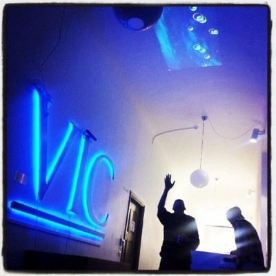
This mix allows the group to support researchers from many different fields, often working with data and questions that require tailored visual approaches. Much of the node’s work takes place in the KTH Visualization Studio VIC, a shared environment used for teaching, research, and external collaboration. VIC provides access to XR equipment, GPU clusters, video‑production tools, and spaces for user studies. For InfraVis projects, these facilities are used for testing ideas, building prototypes, and running training sessions in formats that suit the researchers: on site, hybrid, or remote. Several recent collaborations illustrate how visualization can reshape research workflows. In the VIAMD project, developed by Robin Skånberg, molecular biologists gained new ways to explore complex simulation data. In PolyGone2, biomechanics researchers transitioned from a discontinued proprietary pipeline to an open‑source solution that they can now maintain and adapt themselves. These examples show how practical visualization support can help researchers work more effectively with their data. Across projects, the team encounters recurring challenges that are familiar in many research settings. Visualizations often start out overloaded, with too many data points competing for attention. A common first step is helping researchers filter information and identify the narrative thread that makes the data easier to interpret. Another frequent task is clarifying data structures: many datasets arrive in formats that are not ideal for visualization, with unclear semantics or missing documentation. Addressing these issues early on helps the visualizations become clearer and more useful. By combining technical experience with access to flexible facilities, the KTH node contributes to InfraVis’ broader mission of supporting researchers across Sweden as they navigate increasingly complex data.
| | | | The InfraVis Application Experts at KTHJulius - Specialises in real‑time computer graphics, general GPU programming, and heterogeneous computing. Ingemar - Focuses on 2D/3D graphics, VR/XR, HPC visualization, 3D printing, and basic embedded electronics.
| | | |
NodeGoat Workshop
Where: Ekonomikum, F327, Uppsala University (or Zoom) When: 19 March 2026, 13:00–16:00 | | | | | | Follow InfraVis on Social Media | | | | | If you have news, suggestions or ideas relevant for InfraVis and data visualization, please let us know by emailing info@infravis.se Unsubscribe | |